
Here, you will see how these illustrations are made – from scratch. All the tips and tricks needed, but also how to make variants through coloration and accessories. A comprehensive step-by-step tutorial which also require the appropriate software, Adobe® Photoshop® in trial version for example, or Gimp which is free and open source. Commands differs but principles and tools remains generally similar. However these tutorials will be based on photoshop. To perform a complete illustration from scratch is an average 2-5 hours depending of its complexity. Level of this tutorial is relatively high, not for complete beginners with such software… Tankette Tk.3 illustrator
THE REAL DEAL : Vectorial vs Pixel
Since there are dozens of potent imaging and photo editing softs around, a single one seems to have really own a fame for itself, to the point of meeting the common language and even been use as an adjective. Photoshop® has been the absolute best seller of its company, with a thick matress of wide-range popularity among professionals of photo editing but also graphic designers, and even artists, laurelled as a creativity trigger which far surpass its original goal. Painting on this software has been a sport, an art, and now an industry. Its is everywhere from videogames to film industry and on your average magazine. And it\’s just working with an “ancient” and simple technology : Brute pixel.
At the other side, from the same manufacturer, and using another technology, Illustrator® seems to be more restricted to the field of pure graphists : That means, those who plays with simple forms/colors and combine them at the infinite. With a Cold and smooth render due to its nature, highly flexible, lightweight and CPU saving, vectorial illustration is really from another breed. Nowadays, modern illustrators, marketing and communication, use it to some extent in many fields of design, notably logotyping.
Both solutions had their advantages and drawbacks. From my personal case i can say i mastered and used both during my career, and clearly separate and circumvent them to specific areas and tasks they are best for, depending of the final objectives, an occasionnaly in succession (generally speaking, from illustrator to photoshop).
Illustrator®
Excellent for creating relatively soft and simple designs, it remains lightweight in nature, although using loads of effects and groups of them could explode the CPU charge. Working
with 100+mo vectorial illustrations and copy-cut 60+mo combined elements to another soft and reverse could be a reality when pushing this soft to its knees (and computer responses by the way). If in personal works i tried to make relatively complex illustrations, everytime i was stopped in my tracks by the same problems. This soft can\’t handle “vectorial” complex textures and combinations. It\’s just uneasy and unnatural. In the field of tanks, i did just two illustrations with this soft ages ago as an experience. But since they were too “clinical”, i dropped the idea. For simplistic to more complex “clear-cut”, flat illustrations, technical drawings, Adobe® Illustrator® can do wonders. It\’s indeed very portable and flexible as a same design could be printed from 72 to 600 dpi at a stroke, without any change to the base file -as long as you did not use effects and filters, which depends on the scale. For all shadows and blended forms, it\’s better to use custom assemblies of treated shapes. That can be tricky and end with thousands of grouped shapes, each with variable gradients and opacities. It is not compatible with flash, another vectorial software and one of the best known animation soft. It requires also better mastery to combine shapes or to modify them. It has also richer text handling and versatility, and it is just perfect to create fonts and icons. In short, while importing other elements, you can work only with illustrator and create all kind of visuals, including complete leaflets and booklets. Don\’t mess with it : Illustrator® a really powerful tool.
 Wants to have your hands on it ?
Here is one example, free to download, open and use for any non-commercial derivative work. It\’s a “what if” hypotetical render of the Maus : blitzkrieg46.ai or the .rar version.
Photoshop®
Here we are in another dimension. Compared to the latter, photoshop seems to be simpler to create and handle shapes and allows instant simple tasks like to supress and combine them. Both works well with layers and groups of layers. But this would be unjust to compare them on the spot, as they are proceeding from two completely antagonist technologies. Vectorial illustration is highly flexible . But again, if you need to add some complex effects on your illustration, let say metal texture, rust, fatigue, dirt, mud or snow, there is no way around it : Photoshop is the best around… If you have a good rig that can handle 30 mo+ files composed of 50+ layers, this is just what you need.
A live example ? Try this one (U.S. Army M6 GMC) also free to use (only for non-commercial purposes).
Creating a tank illustration with Photoshop
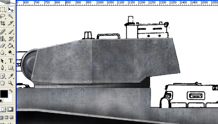
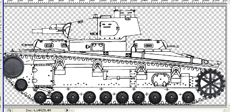
Here we are about to create from “scratch” (in fact at least one black and white profile drawing and a few photo references) an illustration of a rare German tank, the Neubaufahrzeug. A good subject as it is relatively complex.
Step one : Preparing the format.
In our case, once we have an appropriate profile, let\’s get our hands on it. Im my case, i am creating a document of the size of the real tank at 1/35 scale and 300 dpi. So at such scale a reference profile drawing is so stretched that it loose any precision. It\’s just only good to have the general proportions, but photos are there to give better estimate of the shapes and to figure out how the volumes look like, something a simple profile view drawing can\’t give.
In your case, you can work on a basis of 72 dpi at the same scale, it is just easier to handle with a less powerful laptop for example. As a reminder : 300 dpi (dot per inch) is generally used for printing, associated with CMJN, and 72 dpi for web pictures (low-res screen scale), in RVB.
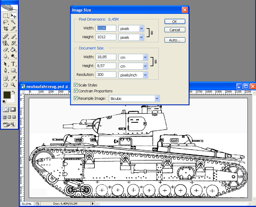
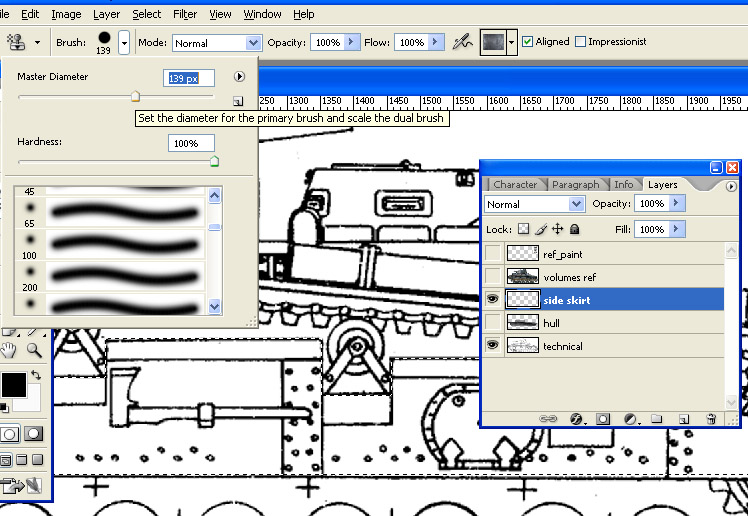
Here we go : We have our “neubaufarhrzeug” document open. Preferences are set to pixel everywhere but you can choose another rule. That doesn\’t matter. You don\’t need many “boxes” on your main workscreen in fact. Just combine 3 tabs into a single one, and you\’re done : “Layers”, “info”, “shapes” (for older versions), that\’s all you need, and of course your left toolbar. In My case, i use a good old CS2 which is really up to the task.
Step two : Preparing the format.
Generally speaking when building this kind of illustation, it\’s more logical to begin with the background and end with the foreground and details (here like accessories, markings, unit numbers, etc).
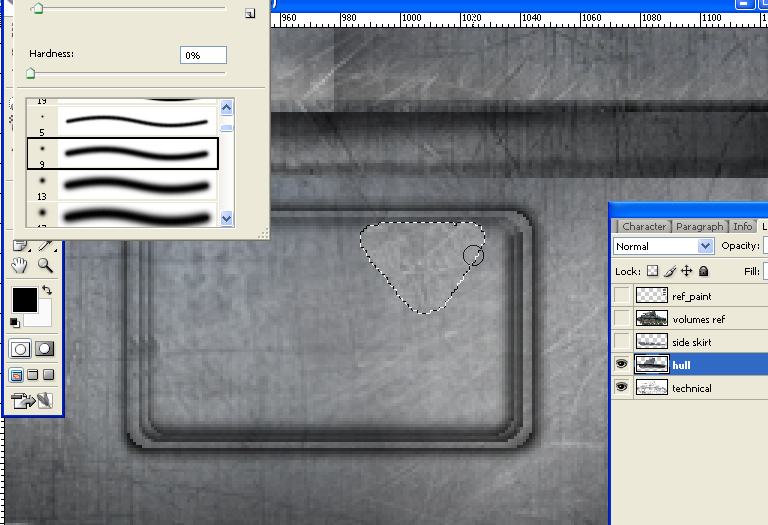
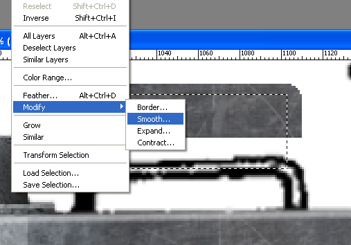
Such illustration can be complex, so we will start with the biggest part : The hull. We are about to make a pixellized “sculpture” from a brute bloc of pixels, adding both the texture and the shadows -in short, the shape. So let\’s start with a selection to create the first part of it. See your toolbox, this is the first icon on the top left side.
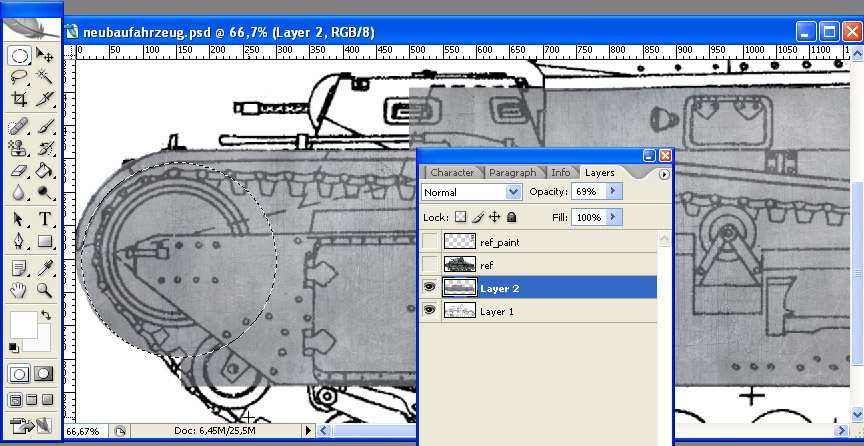
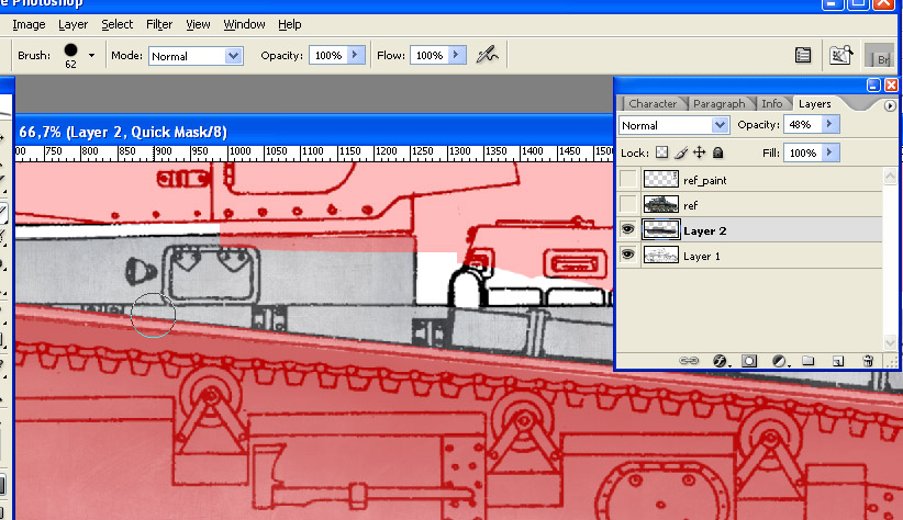
Once the first part we want to work on is selected, (by the way you prefers), we will just swap in mask mode to precise the shape if needed with the brush, but it\’s a personal choice, you can whoose to work around the selection by any means necessary (lasso, plume, ect)… Basically, we will proceed on the same way for evey part of the tank.
Of course do not forget to open a layer to work on !
That would be a mess to forget so, and frenetically plays ctrl+z to try to “cleanup” you base drawing afterwards…
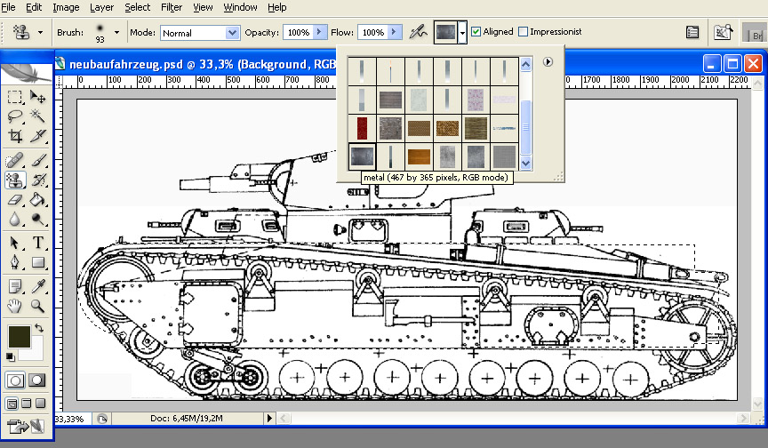
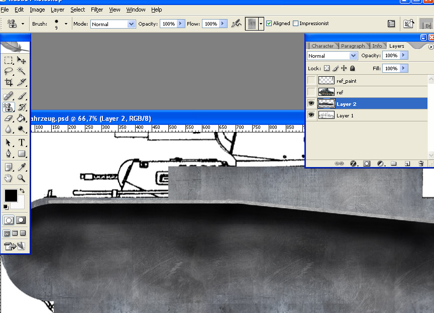
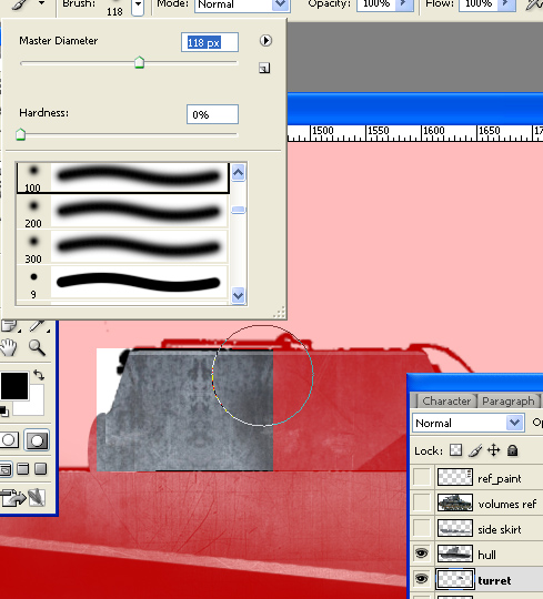
Here we are, with the selection on your working layer, above the base drawing, choose a first metal texture of your choice (“Pattern Stamp Tool” on your left toolbar) to fill the selection with a big brush (prefers a non blended one). Ah, of course you need first to have several metal textures already registered. That\’s easy to do : Google “metal texture”, choose one, copy-cut on a new doc in photoshop, then select it entirely (Ctrl+a). Then, go to Edit > Define Pattern, then name it, save it. Do the same for others, rust, vegetation, everything you can think about and be useful.
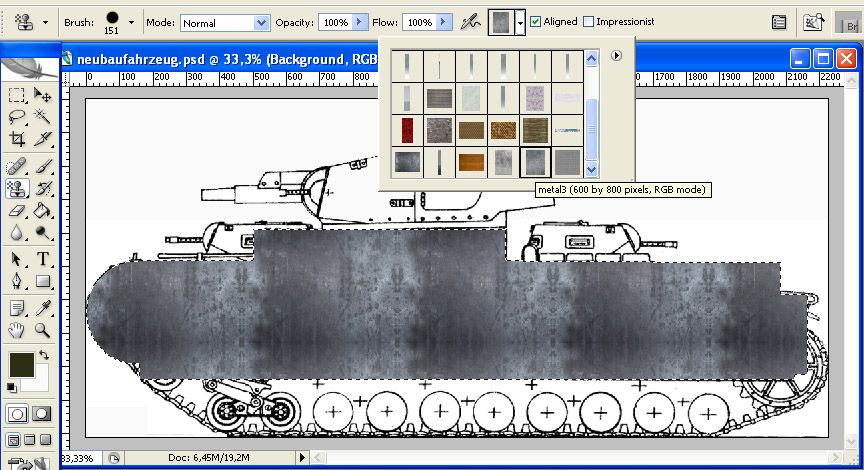
Now, the shape is filled with a first texture. As you can see, the texture was not big enough to fill the shape and we have now repeated pattern. But we are about to fix that. That\’s precisely why we have several metal textures. So choose another one, take a big blended brush, and here we go, paint the separations between the borders of the repeated pattern. You can combine several textures and brush, and paint the whole shape as you feel. At the end what we need is a diverse, composite metal texture which looked like a giant metal part.
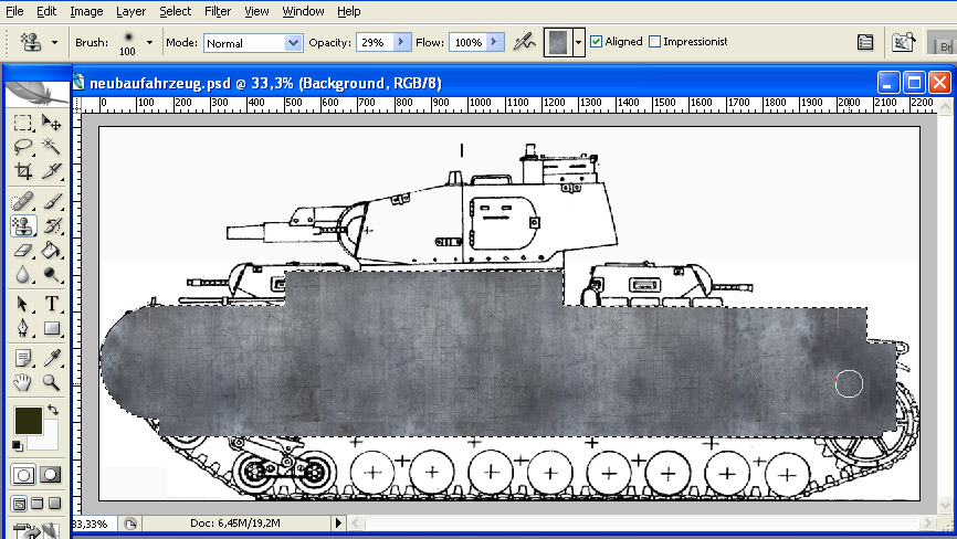
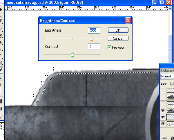
Here is the finished shape. Notice the textures borders are not visible anymore. We have the desired effect. Now, were are going to add shadows to our shape, which is flat, to create volume.
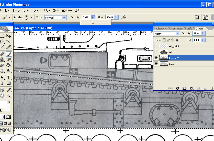
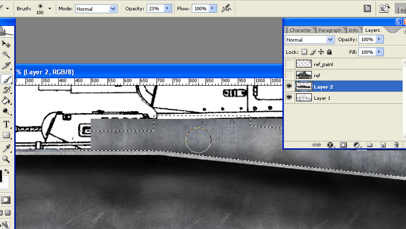
Let\’s go. For commodity, pass your working layer (“layer 2” here) into 60-80% opacity, as you like, to see the drawing behind.
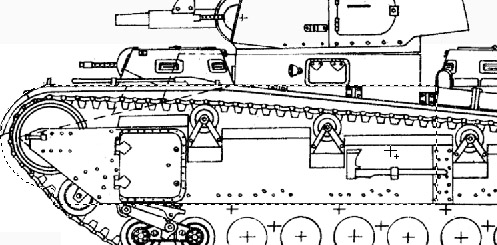
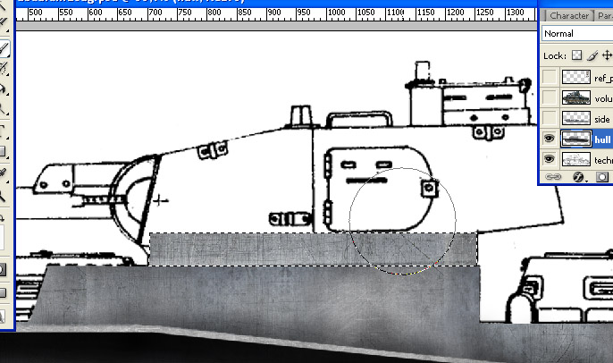
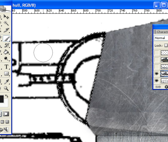
Then, let\’s start with the front lower glacis, just behind the idler wheel. Use selection shapes, combine them, finish the job in alpha mode (mask) if you want, and here we are. Of course photos and a volume profile are useful to see these volumes and work around them on your layer.
Ok. We\’re done. Now we have our selected part, ready to be “shadowed”. This is in fact the big shadow under the mudgards. The more these mudguards are large, the biggest our shadow will be. Now we will take a big, blended brush with black, some opacity (let\’s say 40% and less), and start painting the shape, of course just behind the supposed mudguard.
Now. We have just passed our brush several time, and created a gradient shadow just under the mudguards.
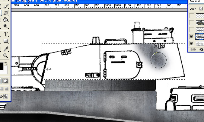
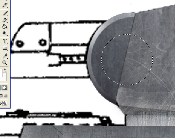
Now we are about to make the upper shadow, just above the mudguard. It would be far lighter. Once again, we need to pick up the desired shape to fill by selection.
Here it is. Notice a softened black brush at low opacity is necessary.
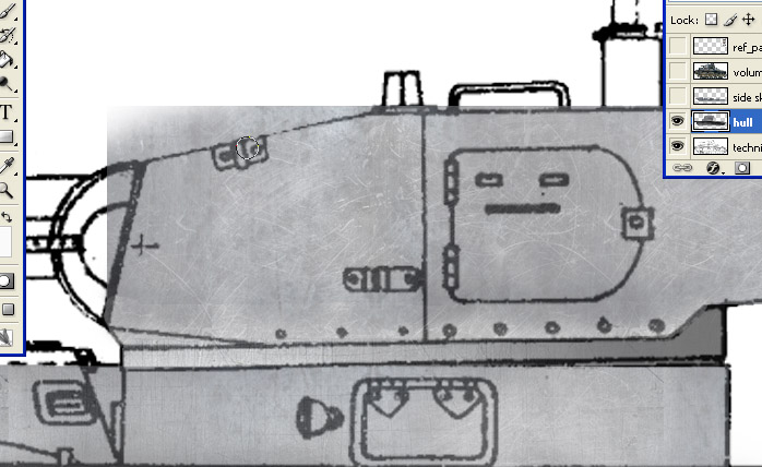
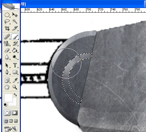
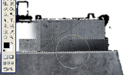
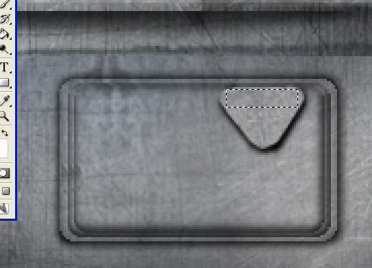
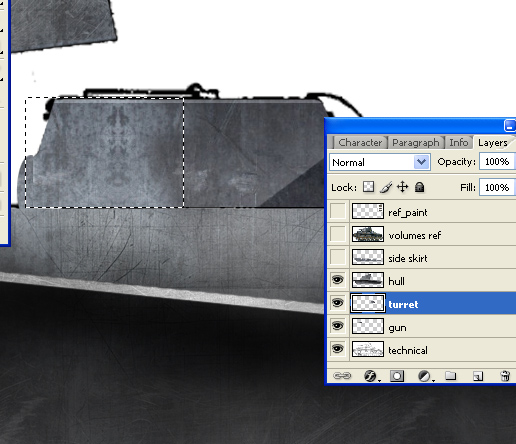
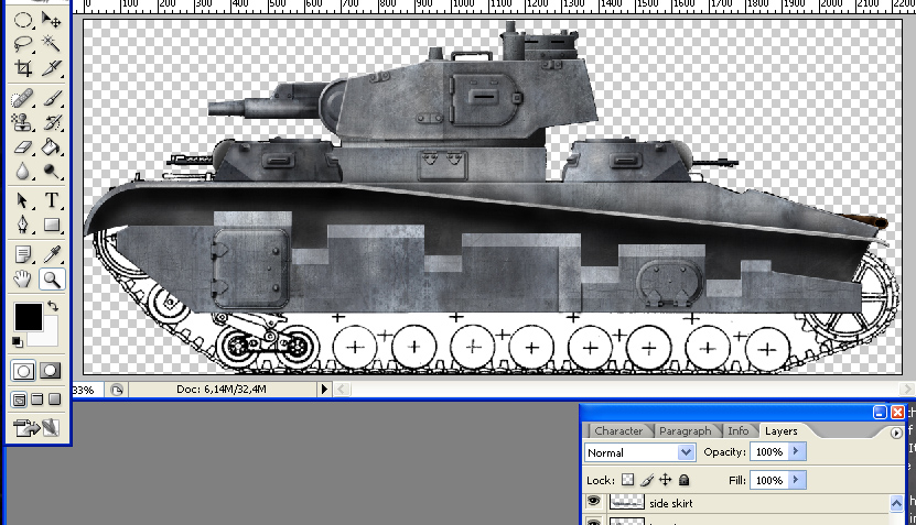
Now, let\’s start the side skirts, protecting the suspensions. As you see there they are complicated, but made of straight lines. So we start to make a selection above the model, and choose the appropriate brush to fill it.
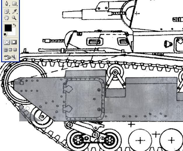
Here is the side skirt filled. As you see the layer is not 100% to allow detailling the surface later.
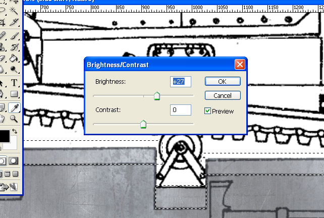
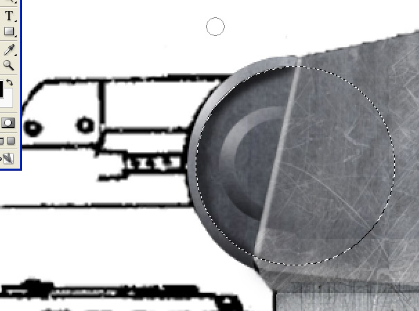
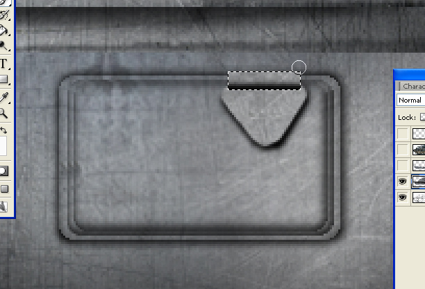
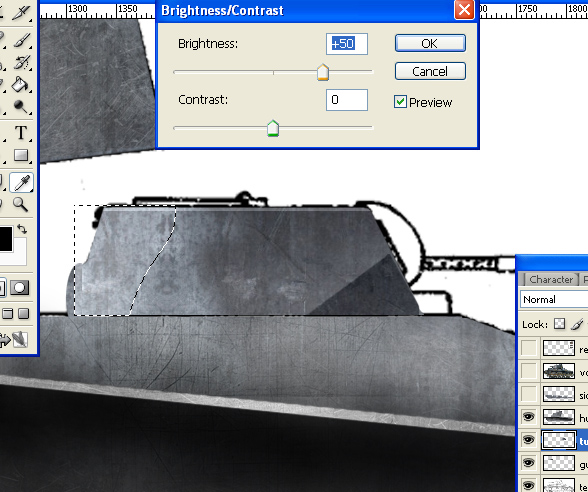
First, we start to create the upper slopes. Notice we do not paint them in a opaque white but rather select the parts and lightening them. This is for keeping intact the metal texture details.
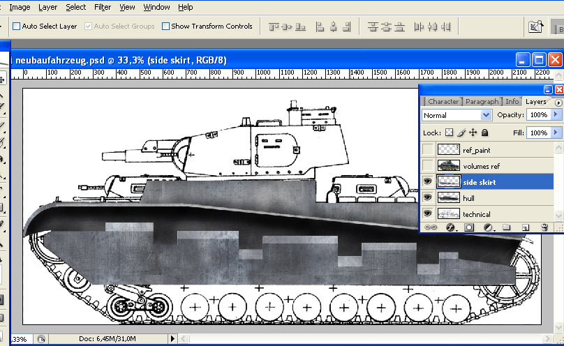
Here is the finished hull, without details, with the side skirts and the hull in the background, with the mudguard separating it.
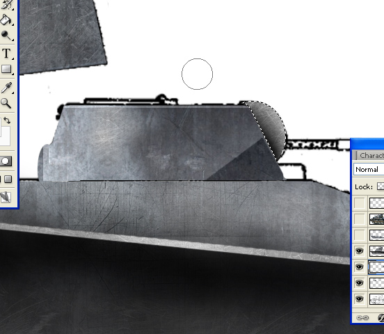
Now let\’s start the main turret. The ring is of course see from profile so we need to make it looking in relief by adding a progressive shadow. A big blurred brush at low opacity (black) is required.
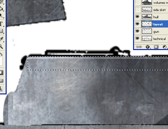
The turret ring is finished. Notice it was a simple approach, we could have also lightly darkened the front part (left) and then enlightening just behind. Now we start with the main turret sides. A simple selection and big brush will do the job, as we will cut the corners later.
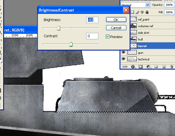
Notice we also covered part of the ring, due to the shape of the turret. We passed the layer in transparency to locate the details, especially the separation between the front and latter side.
Here is the darkening of the rear side.
Now let\’s add the mantlet. This had two part. Will we start from the background one (the largest). We are doing a rounded ellipse with left-click+shift, then shift in alpha layer and erase the surplus part.
Now, the rear part is filled, and we have done a sloped light effect on its edge. Now we are about to explain how to do it with the second part of the mantlet.
We just need to define a second election inside the first one, by either, attempting to do a perfect substractive ellipse with alt+left-click inside, or we can more easily shift in alpha, take a big brush of the corresponding side and then pain the part to remove. When this selected zone is defined, all we need is to either paint with a big opaque white brush the enlightened part, or still in alpha, erase the non-enlightened part.
Now, photos showed the particular shape of the main mantlet, which impose to make a shadow behind the slope. Here its is, simply made after a left-click+shift selection.
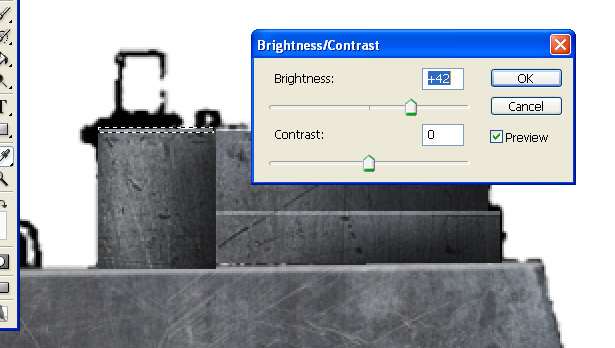
The turret is done, still with few details. Now we are about to make the commander cupola.
The two-parts of the cupola are already filled, we add now a darkening shadow. Notice that the cylinder is put on a large flat surface (here the turret roof), so we don not only need to add a shadow to the cylinder related to the top left light, but also one of the base of the cylinder for more realistic effect.
Here is the front part of the cupola, with another cylinder. Were are about to enlight the upper part of it, due to the fact, it is probably a cast part, so its edge are slightly sloped.
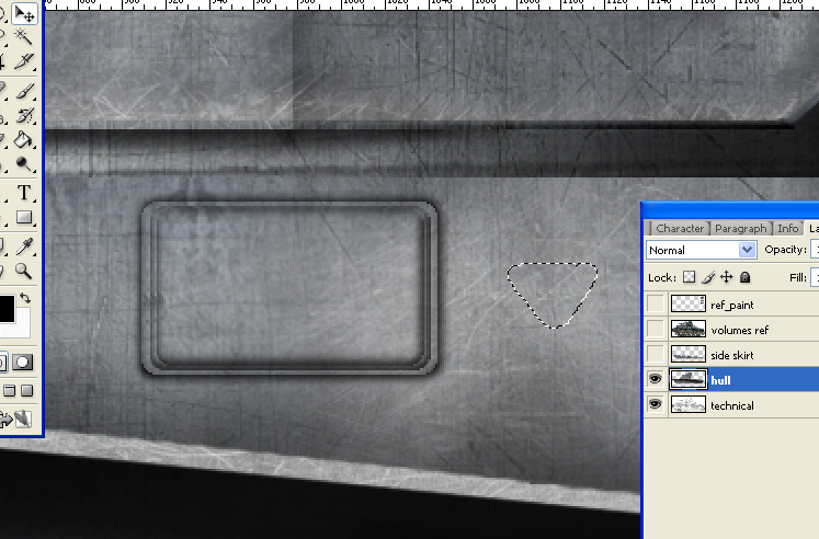
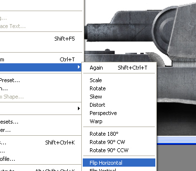
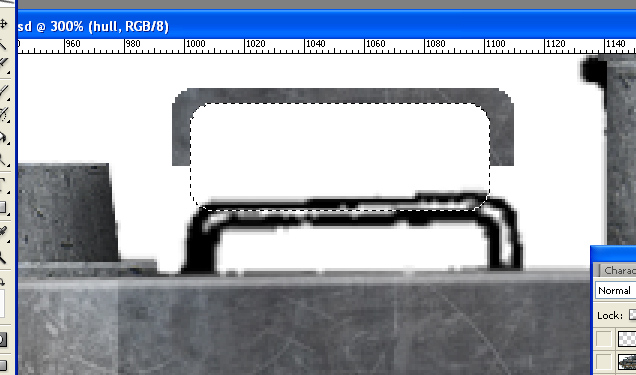
Now, we are adding some details to the upper hull. A hatch is done following two main steps : Define a rectangle, then smooth the selection to have round corners, fill it, makes blurred thin shadow lines on the right and bottom and light lines on top and left part; Second, take this part, copy (alt+left-click move), reduce it (ctr+t) and turn it upside down to invert the shadows. Now you have your hatch. For the details of the hinge triangular support, we will start outside the hatch, define a square and then substract parts of the selection, or shift in alpha and define a rounded triangle with the brush. No magical filter here, just skills.
Now, we just placed this shape over its definitive position, then invert the selection (ctrl+i) and made a shadow around it (more on the right bottom part).
Next step : Creating the hinge itself with a rectangle we will turn into an horizontal cylinder.
The cylinder is now placed on its definitive position, above the support. We will add then the separations between the fixed and moving parts quite simply with a thin (one pixel wide) selection darkened, next to another enlightened, and then copy-move it to create the second one. Note this is copy-moving, not copy (ctrl+c), because in this case you will have each time a new layer. But you can do this way nevertheless.
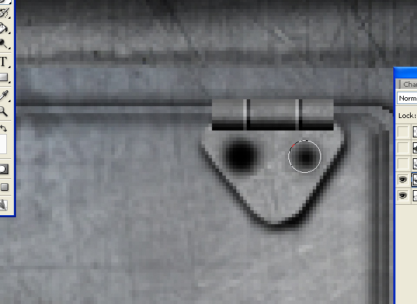
Now we are about to add the bolts. Let\’s start by painting with a black soft brush two spots. Then define a new selection on an untouched metal zone.
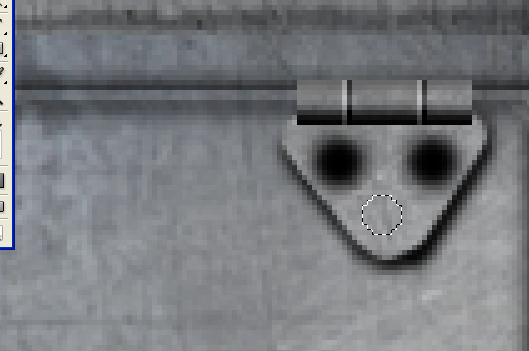
Copy-move this metal selection over the first spot, and then creates a shadow inside it (still with in mind your lightsource is on top left).
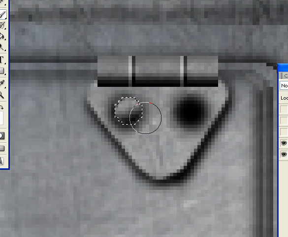
Here is our finished right hinge. Copy-move it above the left part of the hatch.
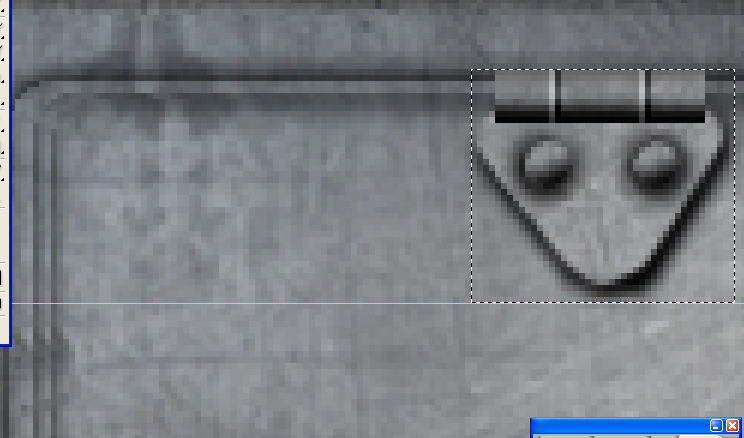
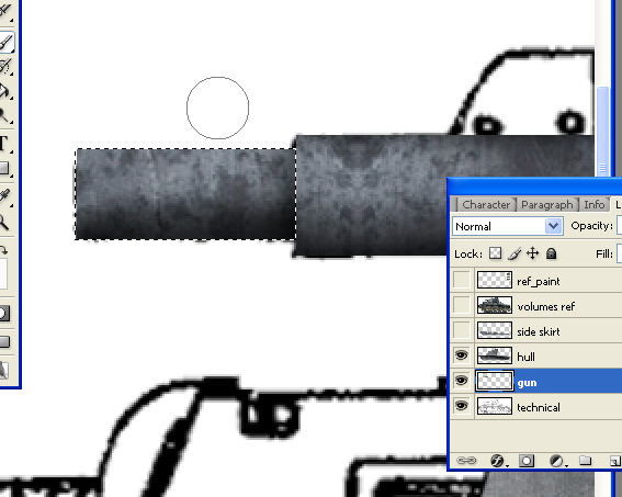
Now let\’s move to the main gun. This is a two-part piece of artillery with a massive recoil spring above, and the gun has two pieces. We are starting with the base part of the gun, attached to the mantlet, by creating and painting a rectangle selection.
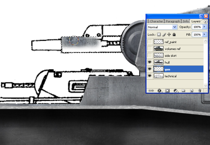
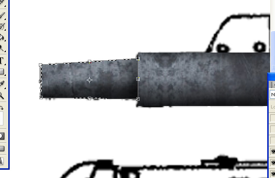
Now, we have created the forward part of the gun with another rectangle. Problem, this front part is sloped, from the front to the rear. So we have to make a deformation of the shape.
To reshape it, let\’s click ctrl+t, then maintained ctrl pressed on while locate the front corners (your cursor turn to a triangle). Move above the first one with your cursor, the cursor triangle turned from black to white. This will allows you to lowering both corners.
Now, get the recoil spring tube done. After defining and filling the shape, we are about to create the rounded top by an appropriate selection. Notice here it is roughly made.
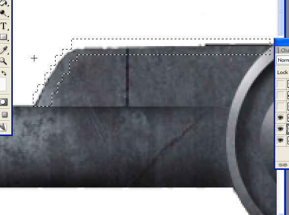
In alpha mode, we can refine this with the appropriate blended brush, on the lower part of the selection.
Here is the enlightenment of the selection. Depending of the shape (you need 3/4 forward views as clues), you will need to widening this selection.

Here are the secondary turret in creation. We are starting with a rectangle, roughly filled.
Now let\’s creating the angular inverted slopes at the base of the turret front. A rough selection, then refined in alpha mode.
Then, the back, which is enlightened after shifting in alpha mode to define a blended zone.
The turret back is done. A big blended brush was needed, given the fact this shape was well-rounded.
Now, let\’s have the mantlet done. Same system as above, a round selection, refined in alpha mode.
This is the lower part of the turret, transition with the top. We just defined a thin rectangle.
Now the turret ring. Nothing magical there, same technique as for the main turret ring.
Now, we have to use the same turret for the front one. The fastest way is of course to take it, copy-move it, then flip it horizontally.
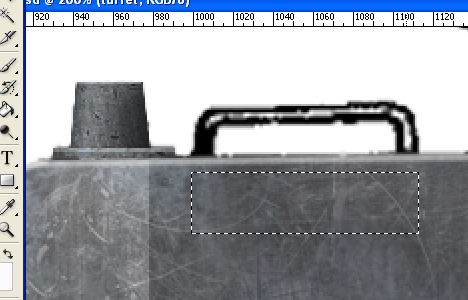
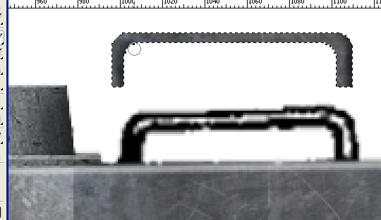
We have passed on this episode, but the second turret\’s shadows were completely re-done and swapped. Now, we are about to create some of the main turret details. Starting with the handrail. As usual, we start with a selection.
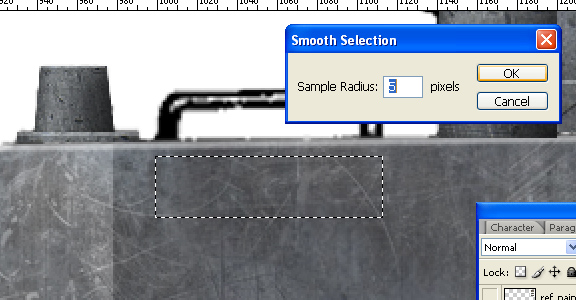
Now, we are smoothing the selection.
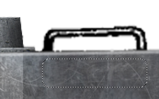
Here is the smoother selection. Of course we will only take the upper part.
The upper part has been moved above its final position, and we are about to dig inside the shape with another smoothed selection.
The selection been done, just delete it; Now, we have our final shape, that needed to receive some volume, by selecting it.
Shadows are been done.
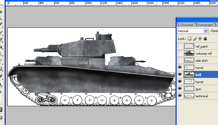
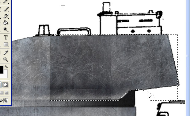
A general view of what we have done so far, without the side skits. We are approximately 30% to the end.
The side skirts are shown, many details later… We do not need to detail every of these, since the techniques are the same as those detailed above, with small variations.
Here is the drivetrain, perhaps half an hour later. Individual roadwheels were made by various selections, and then multiplied. The drive sprocket (rear) was made with a single “bar” copy-moved to two others, each time forced into place with a regular increment, using “shift” after ctrl+t. Same for the single teeth which first covered a fourth of the radius, then was copy-moved three times to cover the entire perimeter. The idler at the front was made using the same technique as the hatch.
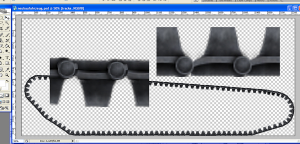
We are not done yet… After doing the suspensions (one, multiplied), were just have to make the tracks. So we start by making two link tracks, one for the lower track and one for the upper track, with specific shadows. When done, it’s quite easy. We just copy-moved every of these, and turned their angles to the rear and front in order to wrap the track around the wheeltrain.
When done, with all layers shown but the black and white base drawing, the “grey”, basic version of the Neubaufahrzeug is done. The second stage will be to give it colors and symbols, in short, the final livery, but there is another story… Just see the final work.
15 replies on “Photoshop Tutorial: Tank Illustration”
Great tutorial, however, make video tutorial and provide some sources from metal texture will be easier for me. I hope you agree. 🙂
Email: [email protected]
I really forward from you.
Hi Wilfredo, thanks for your appreciation
Indeed a video version of this seems obvious
For the metal texture google is your friend, and the only tip i can give is to cross several textures with very large and very progressive brushes to avoid any repetitions. Of course a sub-type would be to vary the finesse of the texture according to the era the tank was built, due to progresses in RHA processing and foundry of course. I’m not saying contemporary metal textures are flawless but you know what i mean 😉
Cheers, all the best !
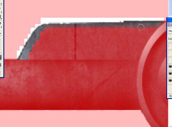
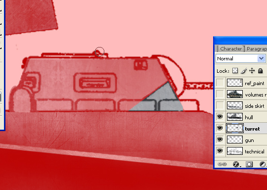
True. I will google for metal texture. Thank you very much for reply! Oh one thing on the 7th picture, where is the red background from? Curious. Im new with Photoshop 😀
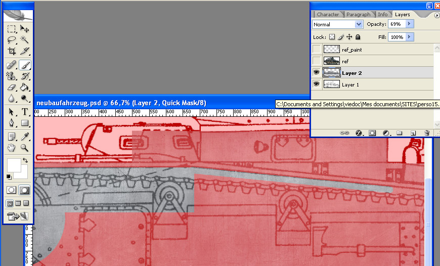
Hi, this is the alpha layer.
A useful tool which allows to “paint” areas with transparencies or for selection
Ah, thank you! 😀
Hey David, Im sorry I don’t know if I’m bother you? Just the last question, how I can make my treads look high quality when its rotation its turn in low quality. How I can fix that?
I dunno if we talk on the same thing for a start. Indeed if you copy-paste and turn an element it has a tendency to loose in quality on the long run (like the curvature of the tracks front and rea, with the links turned six times). The only way is to turn the element to the desired angle right away rather than after successive turns although it’s more time consuming. Photoshop is “inventing” new intermediary pixels for each angle and creates blur.
Can you please make a video tutorial on YouTube? I’m kinda confused.
I really like the illustration of the tanks you made they are really good I have tried to make a Armored Truck illustration but I had some problems. It would be awsome if you could make one for me the Armored Truck I tried to make is the Panserbil 21 its a Norwegian made Armored Truck I tried to make the Panserbil 21 with the turret on top on the roof and I really wanted to make it so I hope you can make this Truck for me. The truck that I want you to make a illustration is the one on the Left in this picture: https://topwar.ru/uploads/posts/2017-07/1499275814_panserbil-23-1.jpg
Hello Max
I hope to do it some day, just need to find at least a near-side view.
Armored cars are faster to make than tanks in general. Glad you like the tuto. Part II is still in the works…
Thank you so much 🙂
thank you so much. i like the tutorial, simple but amazing!
I actually use photoshop quite a bit for work and on the side for some paid jobs.
And I suggest you use a drawing tablet for your photoshop. for photoshop the XP-Pen ( https://www.xp-pen.com ) drawing tablet makes your life so much easier. A tablet will speed up all graphics work you do.
Thanks for your input !
As the author/illustrator i’m used to the mouse. I was offered a long while ago a tablet with a proprietary software incompatible with adobe and which had a shitty software, and i was not convinced. But i know there has been progresses in between, and it’s perhaps time to get my hands on a good one again. Thx and Cheers !
David
Hi David,
Great tutorial, thx for your effort.
As I myself have been creating military profiles for almost 20 years by now and maintain my own site with thousands of ww2 drawings, it was even more interesting to follow you along.
I take another approach, though, starting with vector shapes and then applying pixel painting within these shapes in a raster program similar to Photoshop. This way, you combine the best of both worlds.
Anyway, there are many ways leading to Rome…
Oliver.
Hey Oliver,
We know of your website and are big fans! If you’d like your illustrations featured on our website as well (with due credit and whatever links you’d like), we’d love that.
There is also payment available if you have illustrations for our “upcoming” articles, though it isn’t exactly market rate.
Anyway, best of luck and keep up the amazing work!